VTS
Turning six disconnected products into one CRE operating system at View The Space. 700 components reduced to 160. 90 categorical color options reduced to 4. Level-1 navigation cut by 7×. A new design system, a new operating model, and a new architecture that finally delivered on the "one platform" promise.
Owned the platform strategy that turned six acquired CRE products into one operating system. 700 components consolidated to 160. 7× reduction in navigation complexity. Restructured the operating model across six product squads — and finally delivered on the "one platform" promise customers had been told about for years.
VTS is the technology backbone of commercial real estate — used by asset owners, asset managers, tenant reps, building managers, and tenants to eliminate manual processes and leverage real-time portfolio data.
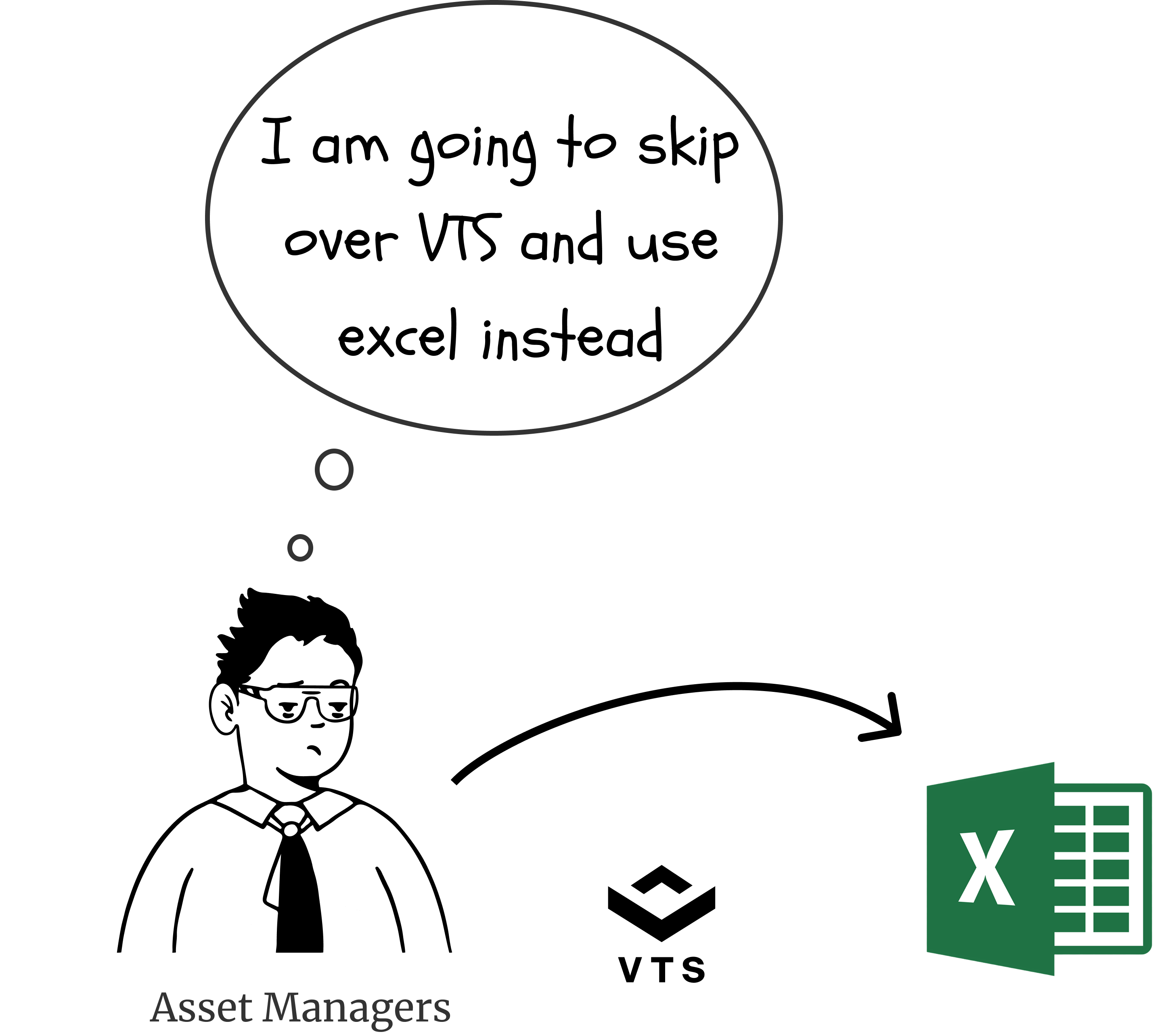
By 2021, VTS had grown by acquiring multiple products — Wave, Lane, Marketplace, Rise, Marketing, and Sandbox — each with its own teams, design language, and components. The promise to customers was "one platform." The reality was six.
I led the design transformation in three sequenced phases — design system first, then design operations, then product architecture — each enabling the next. The promise to customers, finally delivered.
PHASE 01 · UX
Terra Design System
→
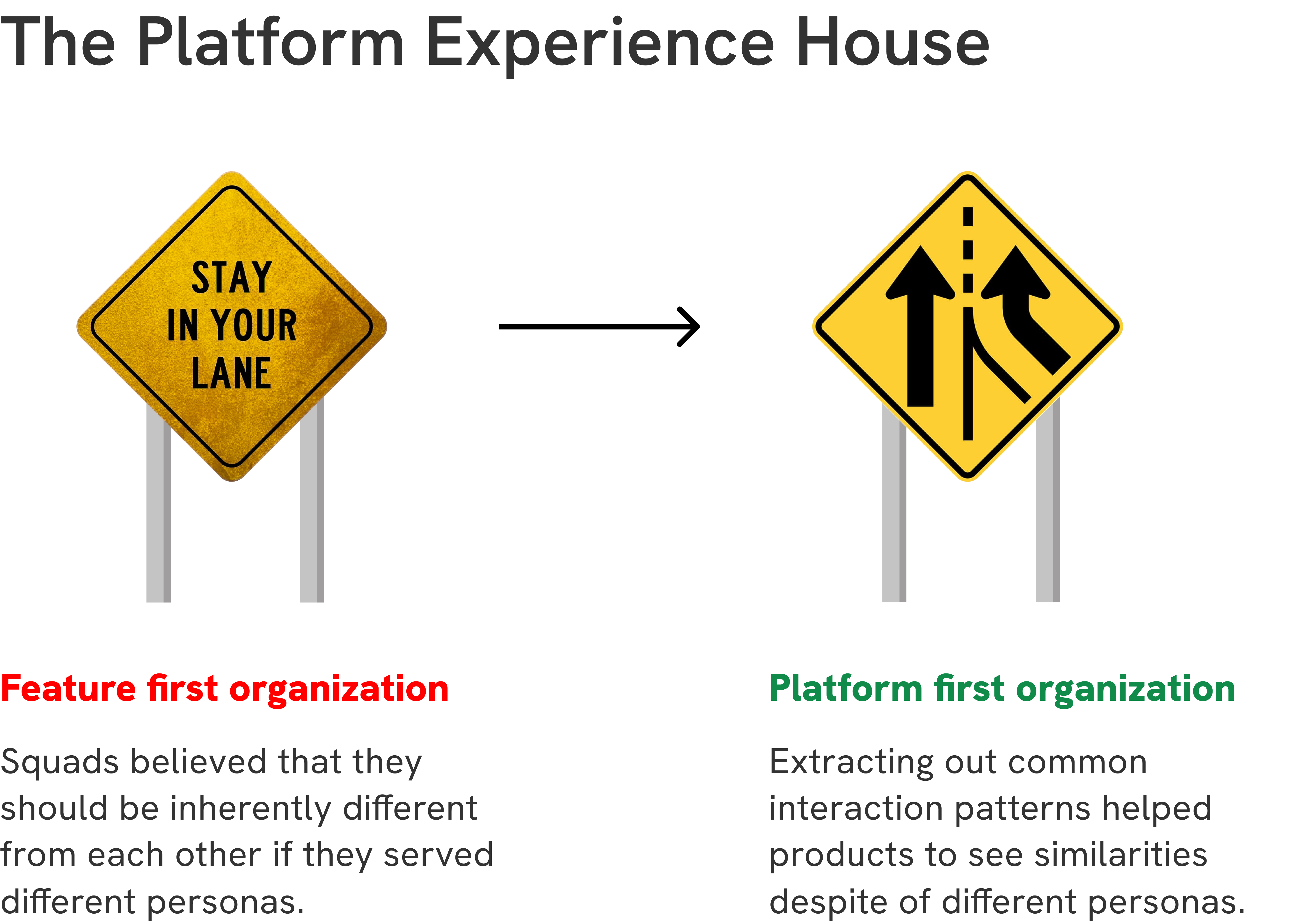
PHASE 02 · OPS
Platform Experience House
→
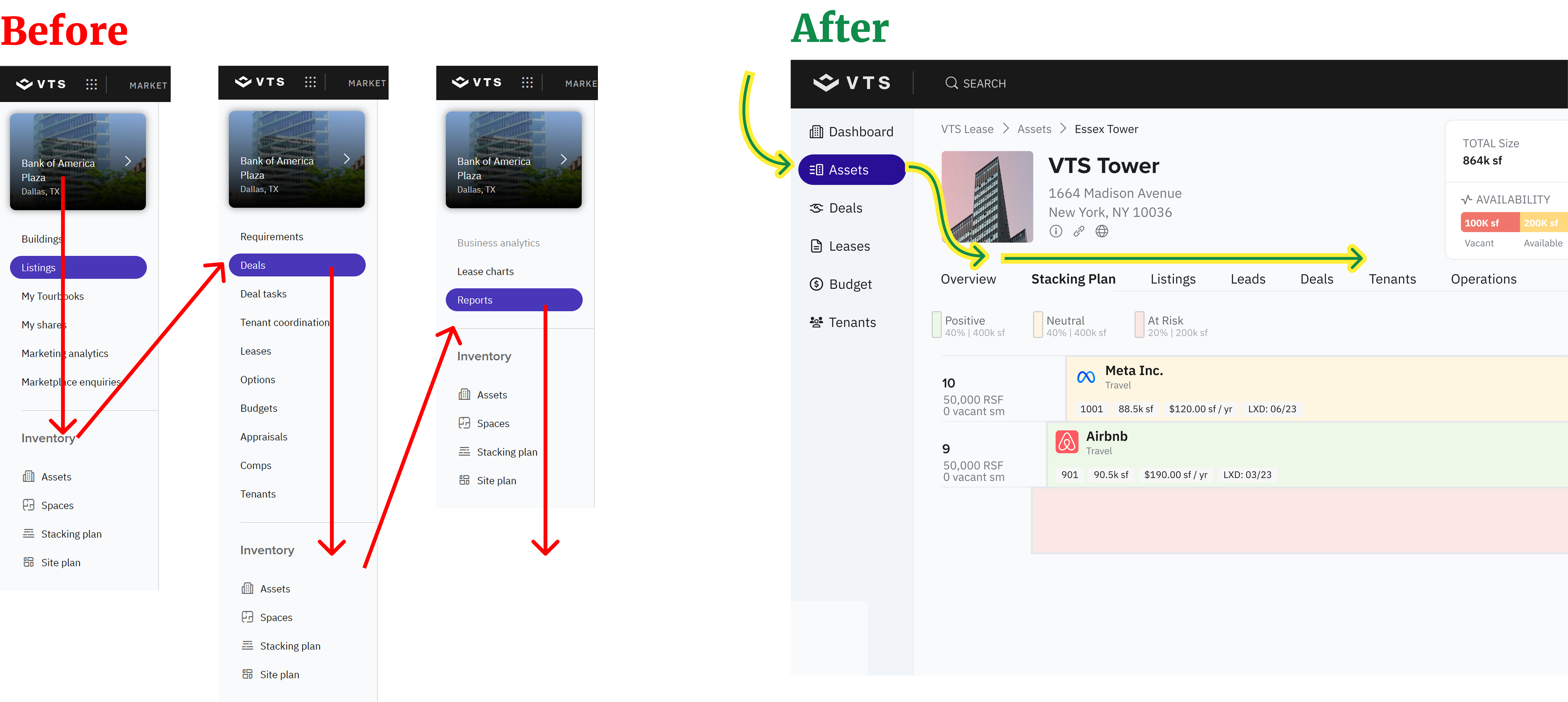
PHASE 03 · PRODUCT
Unified CRE OS
-77%
Components consolidated
From 700 across 6 libraries to 160 unified components.
2–4×
Adoption vs. legacy
Adoption of Terra over the legacy design system.
AA
WCAG 2.0 compliance
Across the entire new component library.